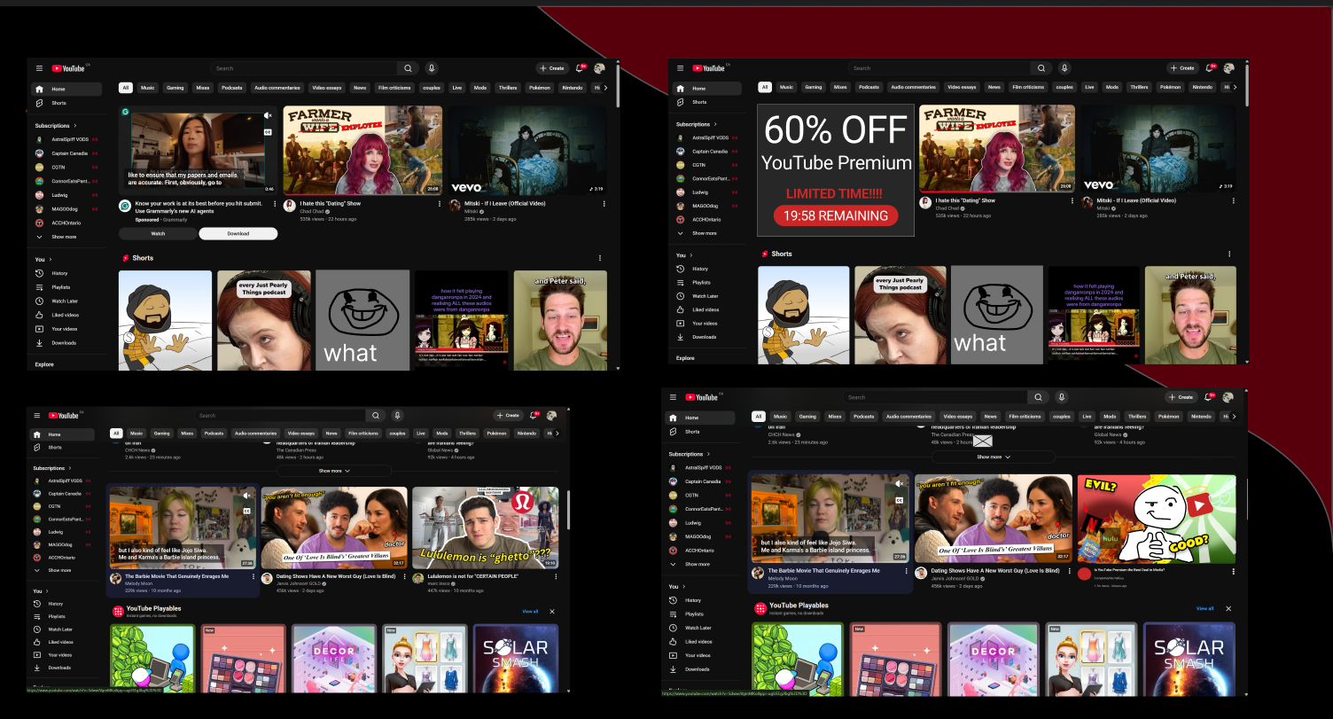
I studied deceptive patterns by adding them into a familiar interface. The point was to understand how surprisingly small design choices can pressure a user, so I could get better at recognizing those choices in my own work.
Why study bad patterns?
I was not interested in making something deceptive just for the sake of it. I wanted to look closely at where ordinary interaction decisions start becoming unfair to the user, because some of these patterns are subtle enough to look completely normal at first.
I kept most of the flow familiar and changed smaller pieces instead. I explored artificial urgency, hidden advertising, confirmshaming and misleading controls so I could see how much the experience changed without doing a full redesign.
Testing emotional pressure
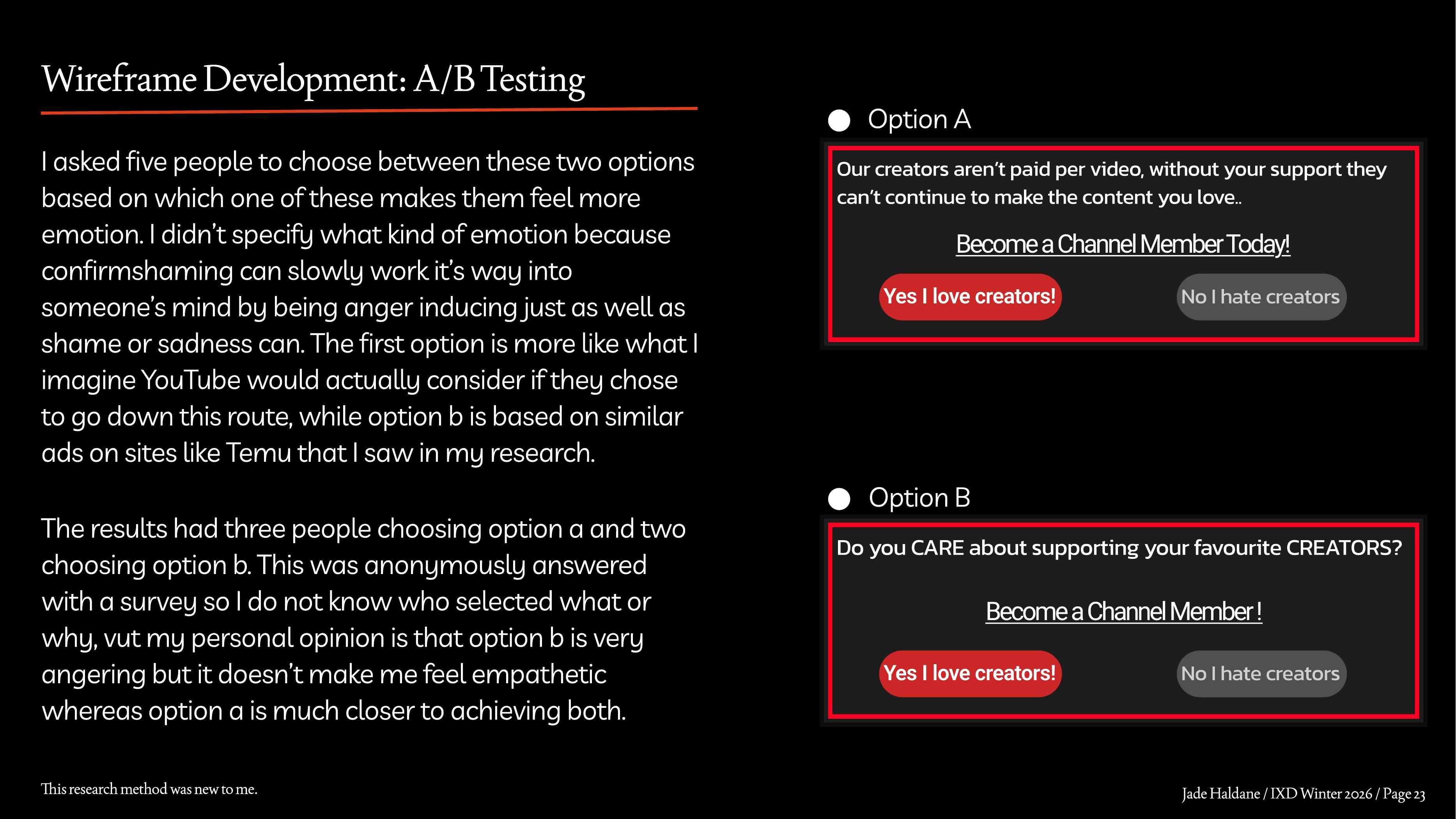
For the confirmshaming idea, I showed two versions to five people and asked which one created more emotion. Three chose the more restrained option. I personally found the harsher version more irritating than persuasive, which was useful because making someone angry is not the same thing as making the pressure effective.
That helped me separate emotional pressure from simply making an interface unpleasant.
Feedback changed the design
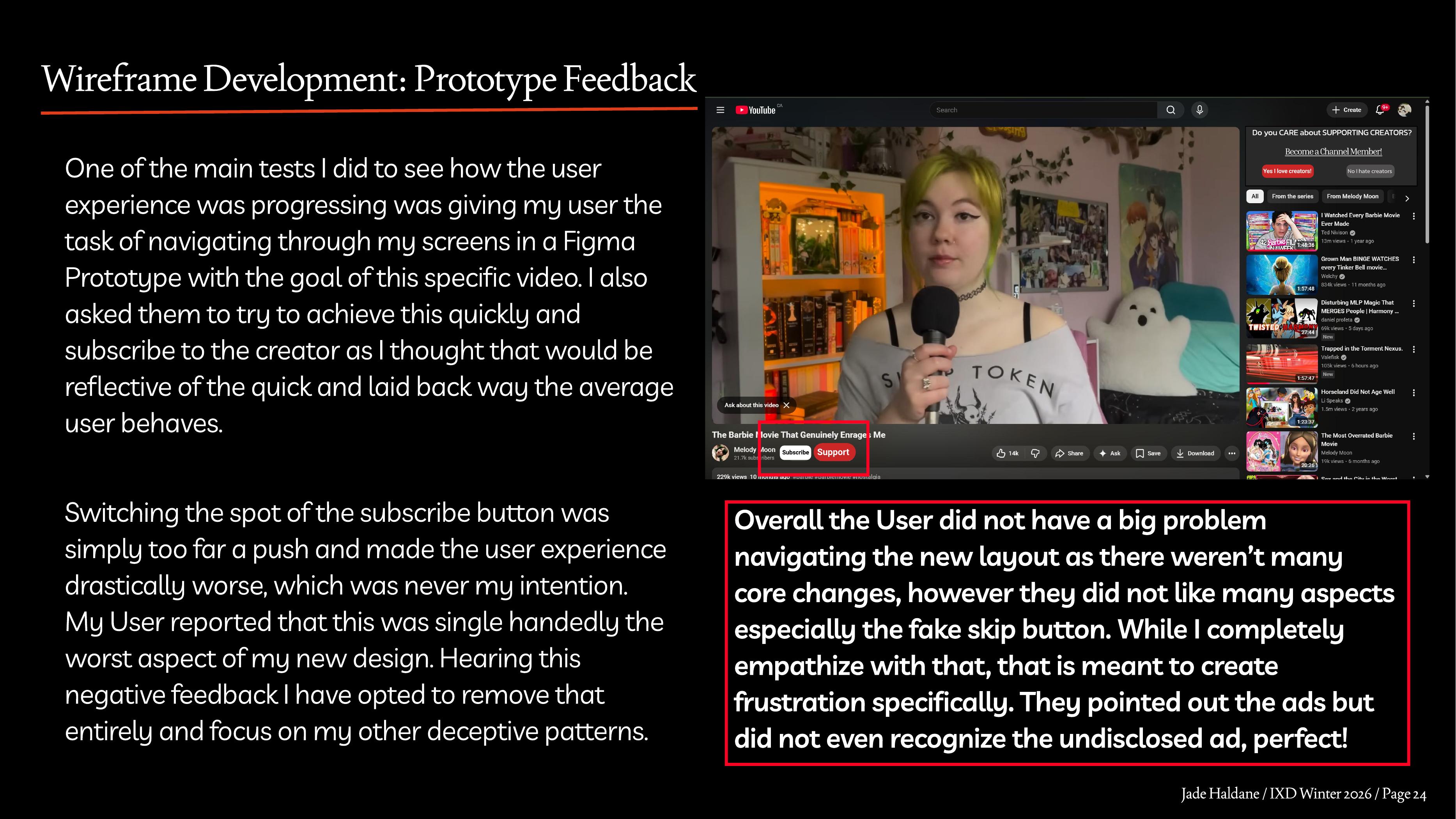
The prototype test gave me the clearest change to make. I moved the Subscribe control as one of the deceptive patterns, but it made the experience so much worse that it stopped feeling subtle at all. I removed it. The participant noticed the fake skip button and the obvious ads, but did not recognize the undisclosed advertisement as an ad, which was much closer to the kind of problem I was trying to study.
The part that failed taught me as much as the parts that worked. If the manipulation is disruptive enough that the user immediately notices something is wrong, it is no longer hiding inside the normal experience.
TakeawayThis project made me much more conscious of how normal-looking choices like hierarchy, labels and button placement can affect whether a user is actually making an informed choice.
Final flow
I kept the final screens recognizable on purpose. The deceptive additions needed to look believable inside an interface the user already understood, rather than looking like an obviously different redesign.