I designed this real-estate concept around one family whose needs did not fit neatly into a single “best home.” The project became much more about comparison than simply finding listings.
Designing around a household
The family had a lot of needs that could compete with each other, including education options, walkability, accessibility, private space and commuting. There was no single filter that could decide what home was right for them, so I wanted the interface to make comparing trade-offs easier.
Structuring the journey
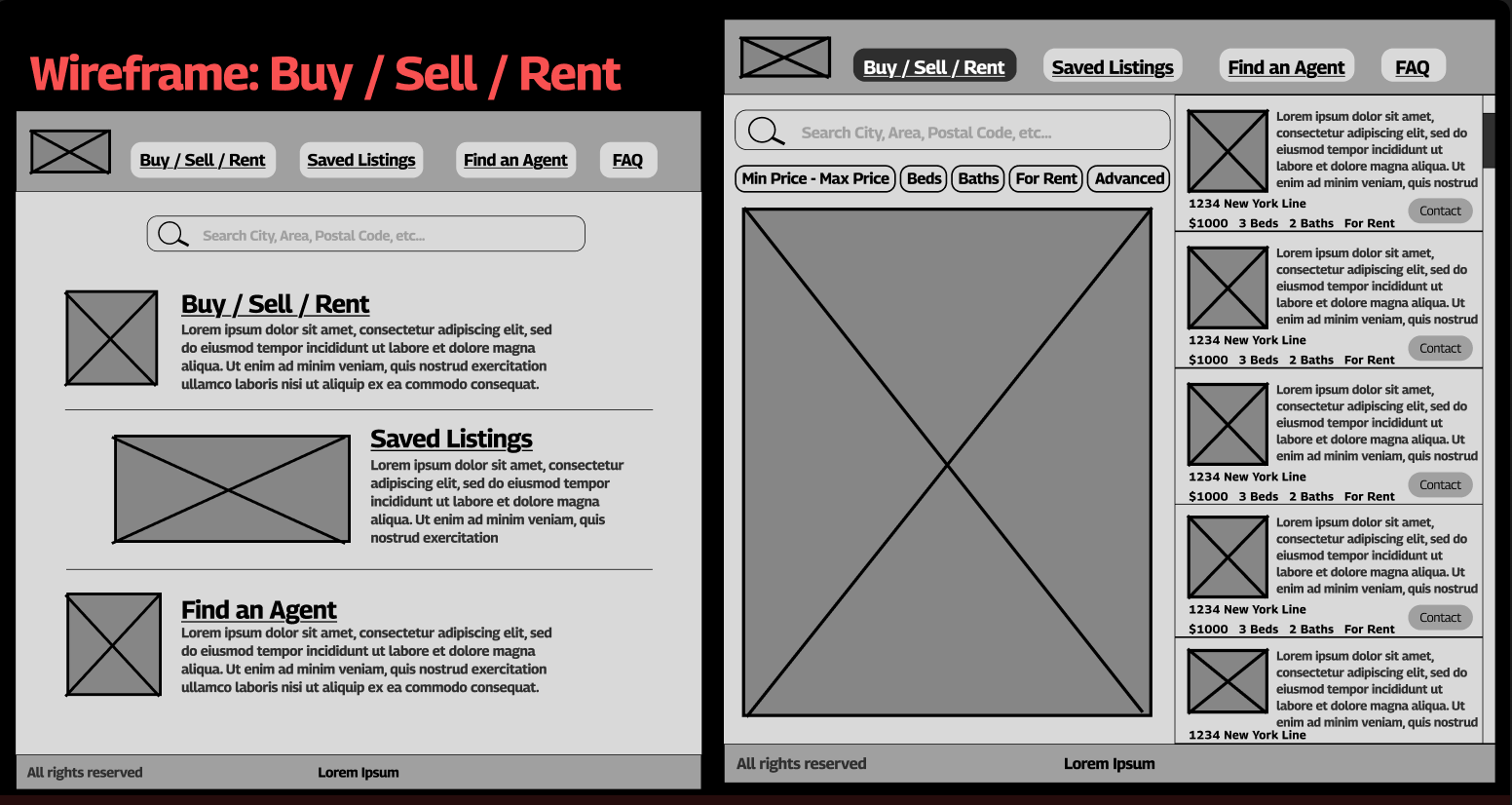
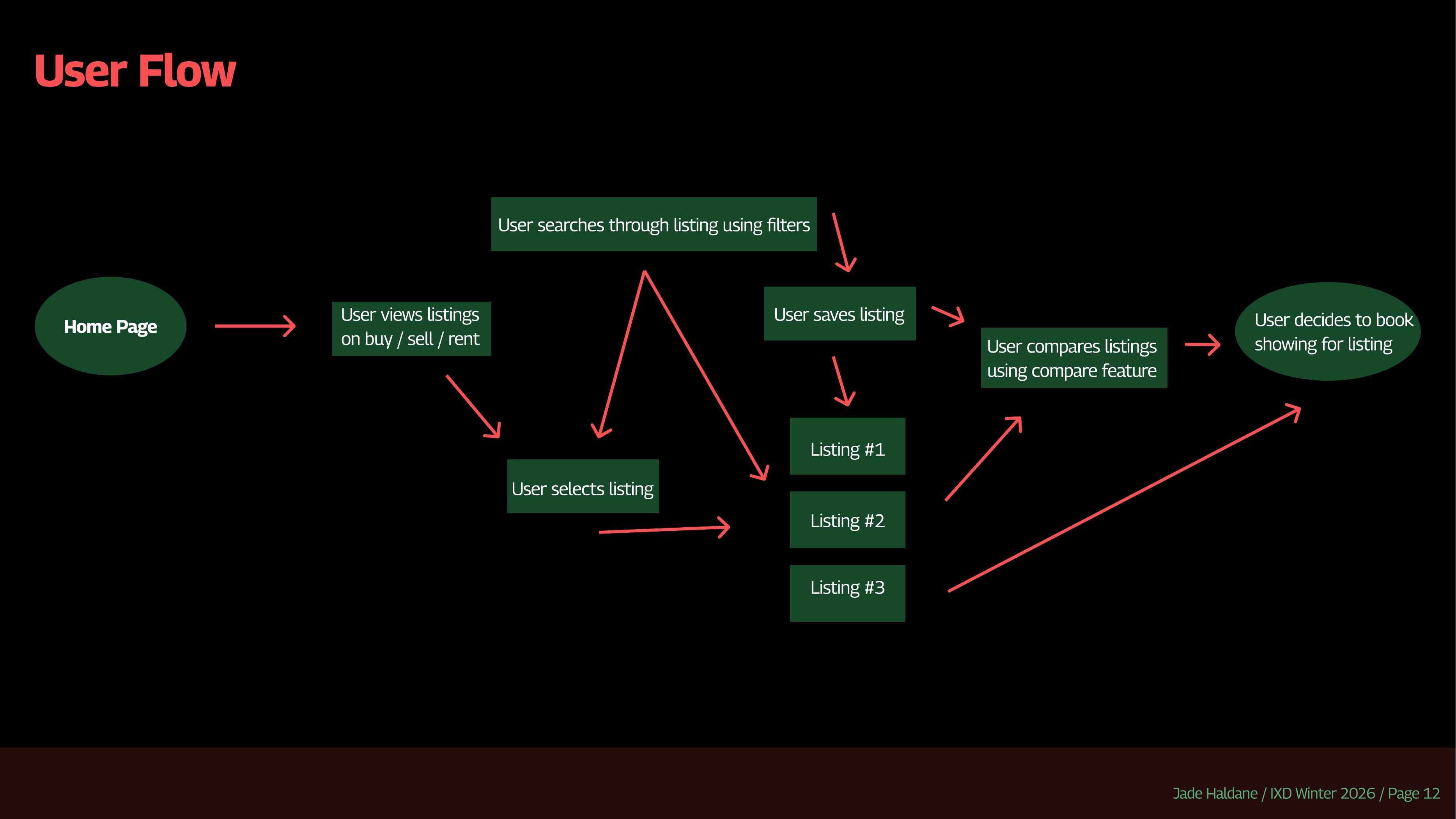
I kept the main journey short. Search and filter, save the homes that look promising, compare them directly, then decide whether one is worth seeing. I wanted comparison to be part of the flow instead of something the user had to do from memory across a pile of tabs.
The flow is built around finding, saving and then comparing listings.
Comparison became the key feature
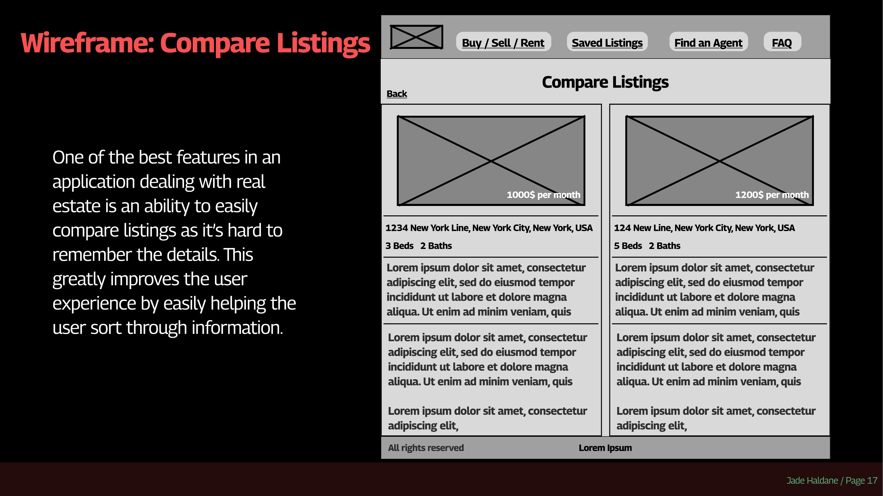
Saved listings help keep track of promising homes, but I think the comparison view is the more useful part. Putting two options beside each other makes price, space and other details much easier to judge in context.
The comparison view brings information that would normally be scattered across listings into one place.
TakeawayThis project helped me think about information architecture as more than where pages go. The structure of the experience can make a decision easier or harder depending on whether the information the user needs is actually available at the right time.